
9 Essential Squarespace 7.1 Design Tips for Stunning Websites
The importance of a visually striking and user-friendly website cannot be overstated. With Squarespace 7.1, achieving this goal has become more accessible than ever. This robust platform offers an array of design tools and functionalities to help users realize their creative visions. In this comprehensive guide, we'll delve into 10 indispensable Squarespace 7.1 design tips that will help you create stunning websites.

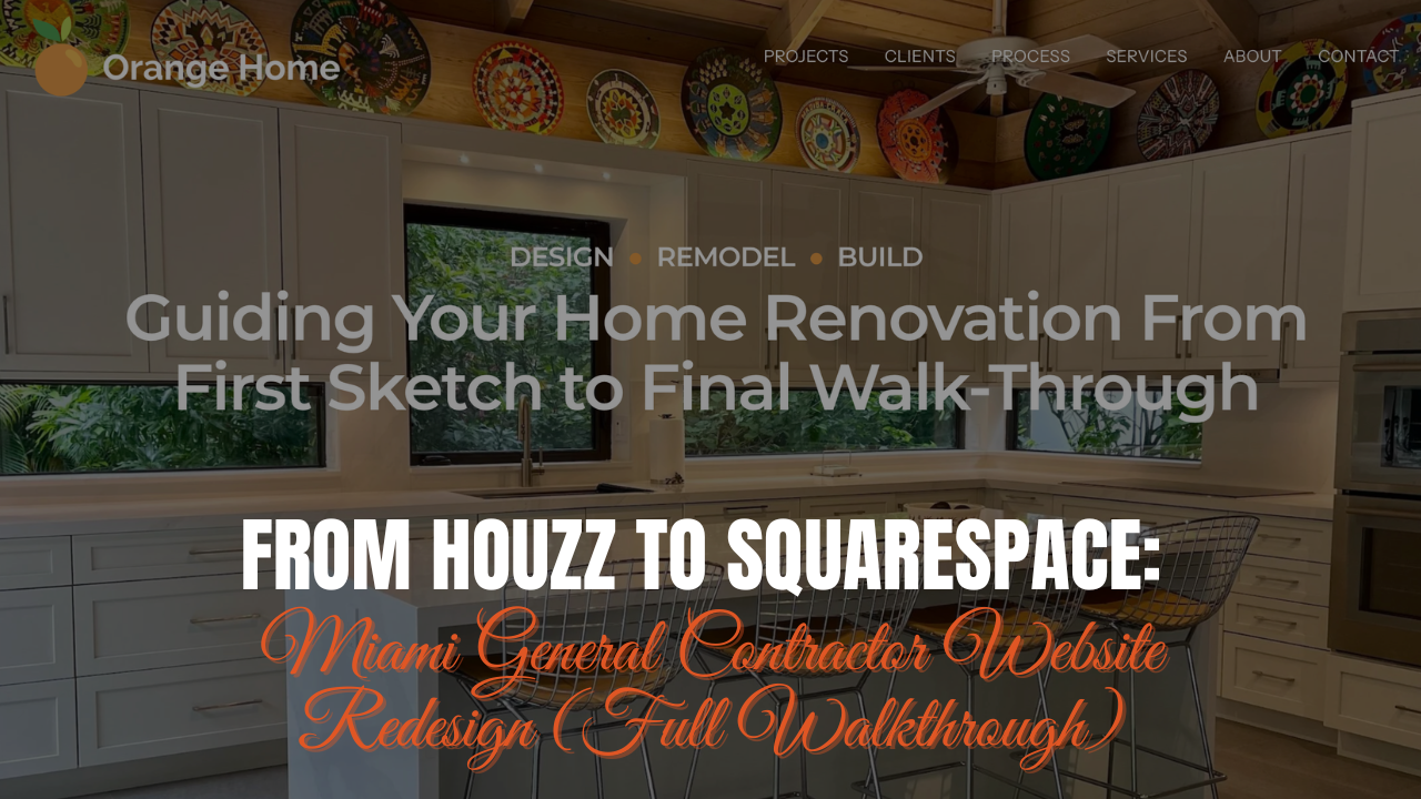
Squarespace Marketing Agency Website Example
Change the Height and Width of the Section’s Grid Using Fluid Engine
At the core of Squarespace 7.1 lies its Fluid Engine grid-based editor, a feature that allows you to build meticulous designs effortlessly. By strategically employing rows and adjusting gap height and width settings, you can attain layouts that are visually stunning and impeccably aligned across various devices. This flexible editor allows for pixel-perfect precision, enabling you to bring your design ideas to life with ease. You have the option to set site-wide section height, or independently design each section’s row height and grid gap using the format options below:
Row Count - Set the number of rows in each section’s grid. You can also set the Row Count (number of rows in a given Squarespace section) independently on mobile vs. desktop. This allows for bespoke mobile designs.
Gap - Set the space between each unit in the grid in order to control the spacing between blocks. Your options are no gap (each unit shrunk next to one another side-by-side), a preset gap (Squarespace defaults to 11 height and 11 width), or click the three dots to set a custom gap by using the slider to increase or decrease the space between each unit both horizontally and vertically.
Fill Screen - Enable this setting for further control over both the height and alignment of blocks and content elements within each section. Disable Fill Screen if you want to remove padding below and above each section. This is helpful for hero sections with content that needs to be pushed higher up above the fold or to mesh two sections closely together so they fit nice and snug. Here are the other options you have when Fill Screen is enabled:
Height - To add padding to each section outside the section grid, choose small, medium, or large height, or click … to set a custom height.
Alignment - Set middle, bottom, or upper alignment to control where extra padding appears within each section.
Divider - Add a section divider to any section of your website and style it to mesh with your existing design. This is a great way to add a little extra pizzaz to your designs.
Incorporate Full-Bleed Background Elements with Precision
Make a bold statement by integrating full-bleed background images, videos, or art into any section of your website. With Squarespace 7.1, you can fine-tune the background image opacity of these elements to create an ideal canvas for overlay text. Whether you're showcasing products, services, or stunning imagery, full-bleed backgrounds provide an immersive experience that leaves a lasting impression on site visitors. Let’s take a look at a few features within the editor that enable you to make your designs POP:
Image Focal Point - Control the focus of a background image added to a page section. Use the circular dot to move the focal point around the uploaded image - allowing for control over how the image appears on the page and it’s relation to any overlay text, say, in a hero section of a homepage.
Image Effects - Choose from None, Liquid, Film Grain, Parallax, Circles or Lines to add animation to any background image or art added to your website. Customize each image effect further by setting the shape and size, motion, and texture.
Background Width - Choose between Full Bleed (the background image will span the full width of the page) or Inset.
Overlay Opacity - This is one of my most used background image tweaks. It allows you to add a colored image opacity to background images added to a page. The overlay opacity color is determined by each sections background overlay setting.
Video Background - Upload a video from YouTube, Vimeo, or your local device to display an auto-play video background without sound. This can come in super handy for hero sections of your design layouts. Just like the background image, you have the option to set your video background to full bleed or inset. Let’s take a look at a few of the additional features available to you using the video background:
Filter - Add blur, brightness, contrast, invert, opacity, saturate or sepia. Use the slider to customize the amount from 0-100.
Playback Speed - Choose to slow down or speed up your background video depending on your audience.
Mobile Fallback Image - Upload an image to replace your video in mobile browsers. This allows you to omit the video on mobile specifically if the design is better suited for a background image.
Background Art - There are tons of background art options to add to any section of your site. Set a section to the background art toggle and customize it’s appearance using four different independent color options, shape and size, motion, and texture. This is a built-in way to add a ton of customization to any section on your site!
Maintain Uniform Spacing Across Sections
Consistency is paramount in web design. Leverage Squarespace 7.1's section height settings to ensure uniform spacing throughout each section of your website. This attention to detail contributes to a cohesive and polished aesthetic that enhances the overall user experience. By maintaining consistent spacing, you create a sense of harmony and flow that guides visitors seamlessly through your site. Here are a few additional pieces of advice on maintaining uniform spacing across your website:
Maintain spacing between block elements - For example, if you have a text block and a button block stacked one on top of the other, ensure the spacing between the bottom of the text block container matches the spacing between the heading and body text. This uniformity should be checked across multiple devices including: large desktop, 13” Macbook, tablet, and mobile. I have a guide on how to fix Squarespace’s Fluid Engine tablet spacing issue.
Allow for whitespace between blocks and sections - Whitespace creates a sense of flow and cohesion and can increase your site visitors user-experience by allowing them to break up content visually. It also allows for clearer focus and reduces clutter.
Create Depth and Visual Interest with Overlapping Blocks
Infuse your website with depth and visual intrigue by overlapping blocks. Whether through image blocks or shape blocks, this technique adds dimension to your design, making your content more engaging and immersive. By layering elements strategically, you can draw attention to key areas of your website and create a dynamic browsing experience for visitors. Let’s take a look at a few examples of overlapping blocks and how they increase visual appeal:
Image Block and Text Block Overlaid - Fluid Engine has opened up new possibilities with block overlapping functionality. Add an image and text block and play with the design to create a message that stands out from the crowd.
Image Block with a Shape Block Background - Add a staggered background color to any Image block - creating a further sense of depth and making a striking impact in your designs.
Image Drop Shadow - This is one I use all the time! By layering a Shape Block over an Image Block and setting the Shape Block to move backwards, you can then add a drop shadow effect behind and image block within your site. This is a built-in way to add depth to your images and make them truly stand out!
Enrich User Experience with Site-Wide Animation Styles
Increase engagement by incorporating site-wide animation styles such as fade, scale, slide, clip, and flex. These subtle animations inject dynamism into your website, promoting interactivity and leaving a lasting impression on visitors. Whether you're highlighting key features, transitioning between sections, or adding a touch of flair to your design, animations can enhance engagement and captivate your audience. Let’s take a look at a few examples of how site-wide animations enrich the user experience:
Scrolling Animation - Once site-wide animations are set - they are “revealed” as you scroll through a page. What this means is that when a website visitor scrolls through sections of each page on your site, they’re met with alluring animations that only reveal themselves based on the user’s scrolling behavior.
Create Dynamic Image and Text Layouts - Combined with the shape block, dropdown shadows, image effects, and animation, you can create bespoke blocks that highlight specific services or offerings. See example below.
Curate a Harmonious Color Palette
Selecting the right color palette is pivotal in establishing a cohesive and visually appealing website. Opt for colors that resonate with your brand identity, complement each other seamlessly, and ensure readability and contrast. Squarespace 7.1 offers an extensive array of customizable color options to help you achieve the perfect harmony for your site. By choosing colors wisely, you can evoke the desired emotions and convey your brand's message effectively to your audience. Let’s take a look at a few:
Set Your Color Palette - Choose from preset palettes created by Squarespace designers, upload an image and pull colors from an image to create your color palette, or create a color palette from a color. Squarespace offers five colors to add to your palette. The following software tools will help with color palette inspiration:
Coolors - The super fast color palettes generator! Their free version offers a ton of value! You can add up to 10 colors to your palette. Start with a palette, lock colors you like, hit the space bar, and watch as Coolors works it’s magic and creates a palette based on your color preferences!
ColorZilla - Download the FREE Chrome App to access the most user-friendly, full-featured, secure and reliable color picker and color related suite of tools. With this tool you can: pick a color from a page, pick color outside the browser, select from a color picker panel, and more! If you love a specific color or color palette on an existing website, this tool allows you to copy the HEX color codes directly to your browser for your own use!
Customize Your Color Themes - Choose from 10 different color themes that can all be independently styled and added to individual sections of your site.

Squarespace Color Palette In Action!
Optimize Images for Speed and SEO
High-quality images are indispensable for a visually appealing website, but they can also impact page load times. Strike a balance by compressing images without compromising quality, thereby enhancing both user experience and SEO performance. By optimizing images for speed, you ensure that your website loads quickly and efficiently, providing a seamless browsing experience for visitors. Additionally, optimized images can improve your site's visibility in search engine results, driving more traffic and engagement to your site. Let’s take a look at a few tips and tools I use for image optimization:
Keep Images Under 250KB - This ensures each image on your page loads quickly and can still display in high resolution.
Add Alt Text to Images - Alt text are clear, concise image descriptions to help your SEO and make your content more accessible. Squarespace allows you to add alt text direct to your image block editor.
Use an Image Compression Tool - I like CompressPNG and CompressJPG which both allow you to batch upload images to reduce image file size and make your website run faster and more effectively.
Use SEOSpace - The Squarespace SEO Plugin & Audit Tool that includes image file size alerts for any image added to a page that’s larger than 250KB. The tool also alerts you if any images on a page don’t have alt text added.
Better Organize your Content with Accordion Blocks
Streamline content presentation and navigation using accordion blocks. These collapsible sections enable you to present extensive information in a structured and easily accessible manner, thereby enhancing user engagement and experience. Whether you're presenting FAQs, product features, or detailed information, accordion blocks provide a user-friendly way to organize and display content, making it easier for visitors to find what they're looking for. By incorporating accordion blocks strategically, you can improve content discoverability and streamline the browsing experience for your audience.
Craft Sleek and Intuitive Header and Footer Navigation
Your website's header and footer navigation serve as crucial signposts for visitors. Design sleek and intuitive navigation menus that seamlessly integrate with your overall aesthetic, facilitating effortless exploration and enhancing usability. Whether you're creating a simple navigation bar or a multi-level menu, Squarespace offers customizable options to suit your needs. By designing clear and intuitive navigation, you ensure that visitors can easily navigate your site and find the information they need. Additionally, well-designed navigation can improve user engagement and encourage visitors to explore more pages on your site, ultimately leading to a better overall experience.
Take a look at some of your favorite websites header and footer navigation. What do you notice? Typically a well designer header navigation will be user friendly and informative—presenting main navigation links that make sense to every website visitor. The footer also acts as a signpost for design success; meaning you can add a mini navigation, your privacy policy and terms and conditions, and any other interactive elements that are important to your site visitors once they’re through scrolling through each page.
Conclusion
With these 9 indispensable Squarespace 7.1 design tips, you possess the tools to create websites that captivate and resonate with your audience. Leveraging the platform's robust features and design capabilities, you can bring your creative vision to fruition and establish a compelling online presence for your brand or business. Whether you're a seasoned designer or a novice, Squarespace 7.1 empowers you to craft visually stunning and functionally robust websites with ease and finesse. By incorporating these tips into your design process, you can create websites that not only look great but also provide a seamless and engaging experience for visitors.
Your Designer
I'm Travis, an expert Squarespace web designer and 7+ year former Squarespace employee. I have worked with every type of business, building platforms for solo entrepreneurs through to multi-million dollar corporations. If you want to discuss a potential project, you can email at travis@coyotemooncreative.com. Alternatively, you can book a 30-minute consultation call here.
Newsletter Signup
Sign up for my newsletter to receive detailed Squarespace design tutorials delivered to your inbox monthly. Get practical Squarespace design tips, as well as digital marketing strategies to grow your online business.


