
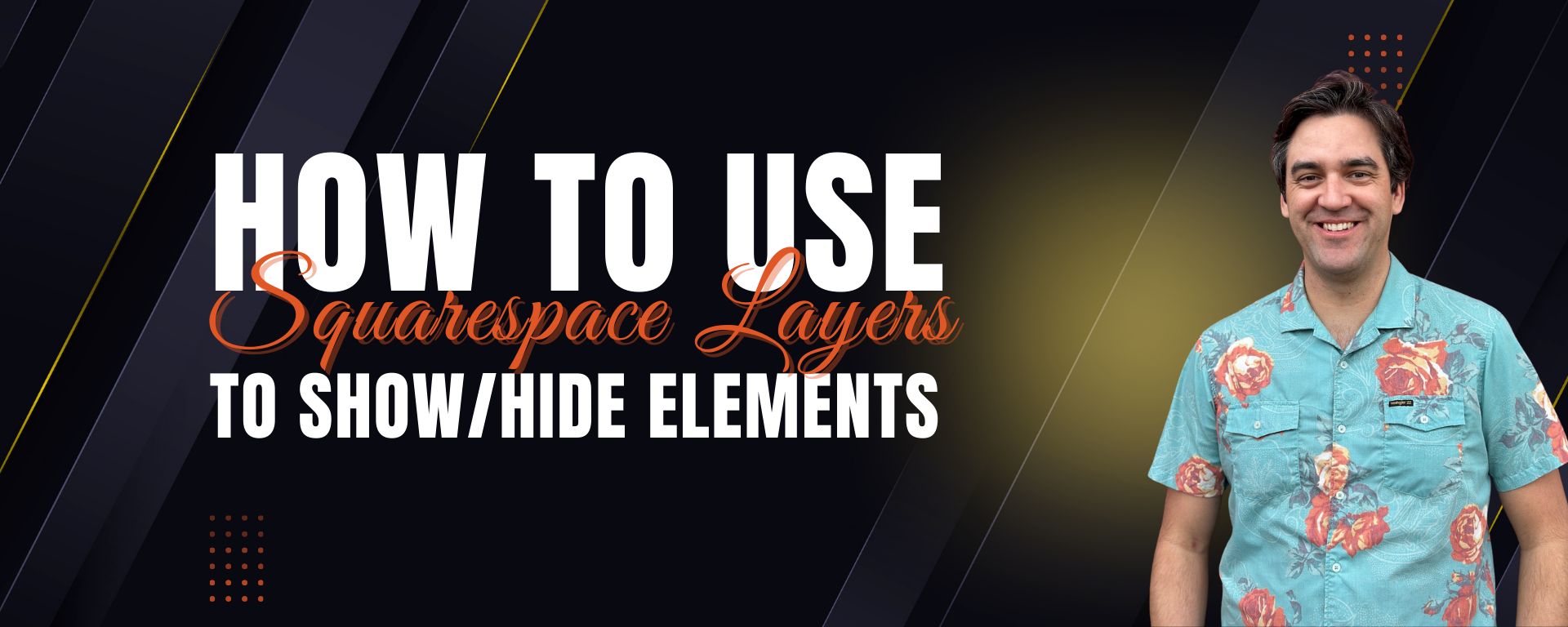
Mastering the New Squarespace Layers Panel: How to Show or Hide Elements for Cleaner, More Responsive Design
Squarespace just rolled out a feature I've been hoping to see for years: a Layers Panel that lets you instantly show or hide elements on desktop or mobile. No duplicate sections. No CSS workarounds. No frustration trying to keep two versions synced. Just simple, intuitive control over how your content appears from one device to another.
In this post, I’ll walk you through what the Layers Panel is, how it works, and why it’s a game-changer for any business trying to create a clean, modern, conversion-friendly website.
Watch the Video 👇
What Is the Squarespace Layers Panel?
The new Layers Panel gives you a visual, structured view of every block, group, and element on your page. Think of it like Photoshop or Figma layers—but for your website. You can see each piece of content stacked in order, rename things to stay organized, and now, with one click, choose whether an element should display on:
Desktop only
Mobile only
Both devices
It’s the most control Squarespace has ever given designers and DIY builders without dipping into custom code.
Why This Feature Matters
Until now, showing or hiding elements based on device required adding custom CSS, duplicating entire sections, or settling for clunky layouts. The Layers Panel solves all of that by giving you:
1. Cleaner, more intentional design
No more “one layout fits all.” You can tailor your mobile experience without wrecking your desktop design—or vice versa.
2. Faster workflow
Instead of duplicating sections and managing two versions, you can simply toggle visibility.
3. Better user experience
Mobile visitors don’t need desktop-heavy content, oversized sections, or unnecessary visuals. And desktop users often want more context and visual storytelling. This feature bridges that gap beautifully.
4. No CSS required
Great news for DIY website owners and small business teams who don’t want to maintain custom code over time.
When to Use (and Not Use) This Feature
Use it when…
Your desktop layout feels too crowded on mobile
You want more control over storytelling on larger screens
A certain block looks misaligned or awkward on smaller devices
You want to simplify mobile scrolling
You need alternate calls-to-action depending on device
Avoid using it when…
You're hiding too many elements and confusing your design system
A simple layout change could fix the issue
You’re using it to patch a deeper structural problem
SEO-essential content might disappear for mobile or desktop visitors
As always: design with intention, not band-aids.
Need Professional Help With Your Squarespace Site?
If this update has you thinking about refreshing your site, improving your mobile experience, or tightening your brand storytelling, I’d love to help.
I’m Travis Vance, a Squarespace Circle Platinum Partner and Marketplace Expert who has built 125+ custom Squarespace sites across industries—from nonprofits and creatives to e-commerce and high-growth service businesses.
👉 See my portfolio: https://www.coyotemooncreative.com
👉 Book a strategy call: https://www.coyotemooncreative.com/contact
Let’s take your site from a yip to a howl. 🐺
Newsletter Signup
Sign up for my newsletter to receive detailed Squarespace design tutorials delivered to your inbox monthly. Get practical Squarespace design tips, as well as digital marketing strategies to grow your online business.
Want More?


 Travis Vance
Travis is a seasoned Squarespace pro with over 8 years of experience helping SMBs, entrepreneurs, and eCommerce merchants win more business online.